The Aesthetics of SaaS: The Rise of Sleek Dark Interfaces
How brands like Linear, Stripe, and Mastra are defining a new visual language utilizing micro-animations, glassmorphism, and neon gradients.

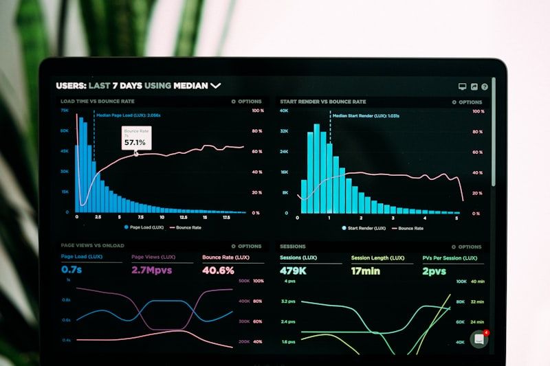
Product design in the SaaS space is experiencing a premium renaissance. The flat, bright, corporate aesthetics of the mid-2010s are giving way to high-contrast dark modes, glowing borders, and realistic depth.
This style, popularized by productivity tool Linear and payment platform Stripe, blends minimalist layouts with futuristic visual accents.
Key Design Patterns of Premium Interfaces
- Dark Canvas with Vibrant Accents: Rich charcoal or deep black backgrounds punctuated by neon blue, purple, or green highlights.
2. Glassmorphism: Semi-transparent panels using CSS backdrop-filters that give a layered, physical feel to interfaces.
3. Micro-Animations: Extremely subtle transitions on hover, helping the interface feel responsive and alive.
Implementing these patterns requires strict attention to detail—precise 1px borders, custom font pairing, and color harmony. The goal is to make the software feel like a physical, premium device.
Sophia Chen
Lead AI Architect at CJP Media. Former researcher in cognitive computing and compiler engineering.
Regular contributor to CJP Media. Specializes in deep-dive editorial analyses, systems architecture, and modern startup ecosystems.